Everyone has a different style of editing. Different color palettes, contrast preferences and tools. One of my favorite tools to use in Lightroom and Photoshop is the tone curve. It is a good all around tool to use to adjust color or lighting.
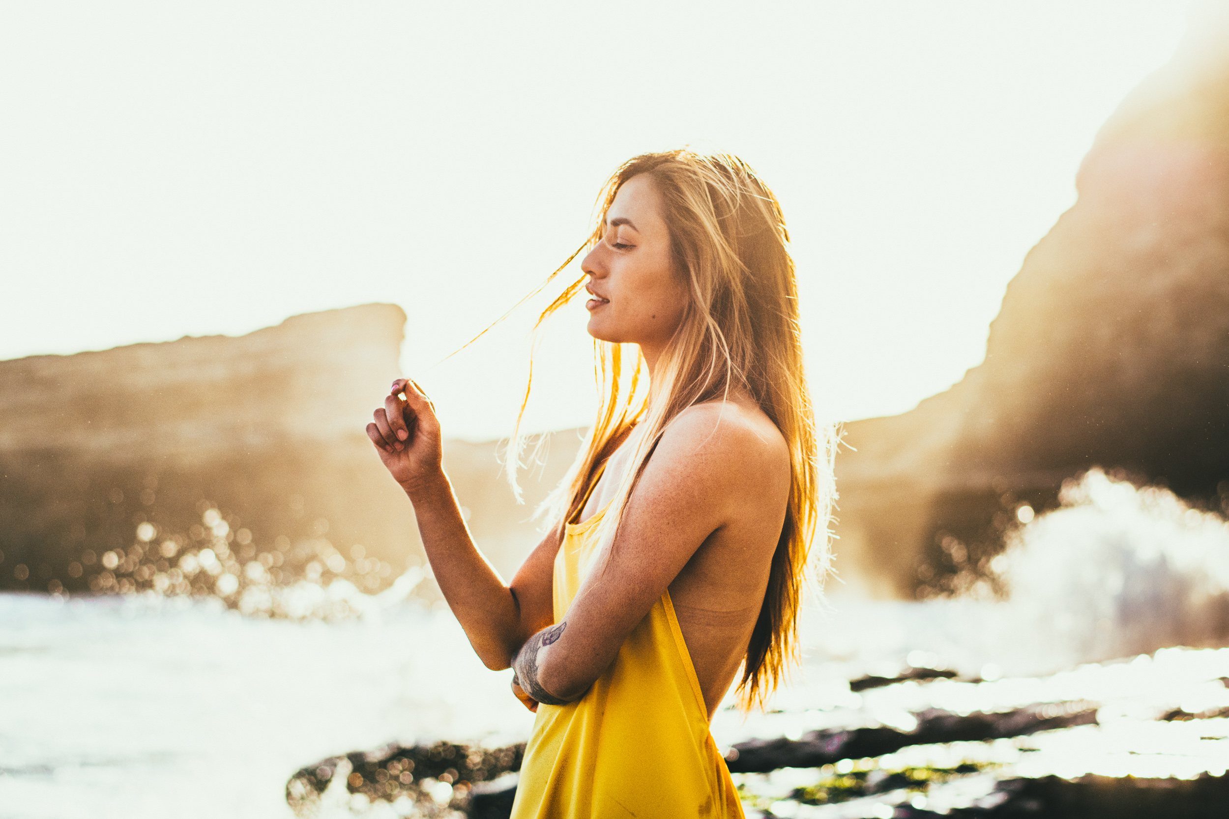
Let's start with this image of Dani. It was shot on my shoot with her on the beach during golden hour. It is backlit, so a lot of the background was blown out and a haze covered her in the foreground.
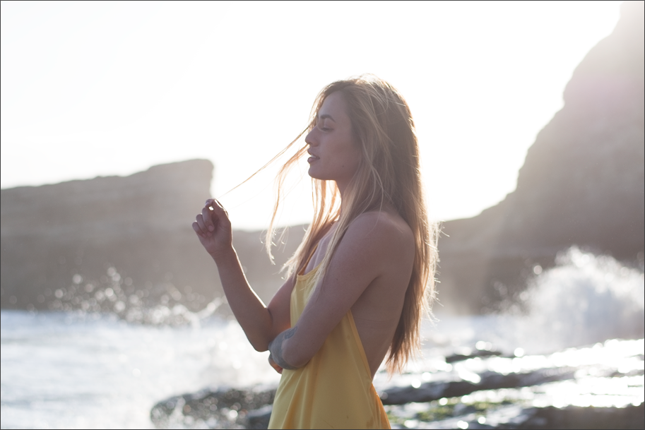
To start off, I did some adjustments using the basic tools. I made the photo warmer than when it was taken to bring out the summer feel. I did some other adjustments too to bring out the shadows and add a little bit of contrast. Just adding contrast adds a lot of color to a photo, so using the hue and saturations sliders I unsaturated a lot of the colors, along with some hue adjustments.


Now onto what this post is about, tone curve. There are four curves to work on, when using RGB color mode. The first curve is RGB and controls the lighting on in the photo. Both axes range from your blacks to your whites. The x axis is the rage of your photo and adjusts the brightest and the darkest point on your photo. The graph portion is the different values on your photo. On this photo, you can see that there is almost no points on the photo that are black and some that are white and blown out. When photos are taken with the graph having points on the minimum areas, they cannot be brought back. The y axis controls the value of the points. In this one, you can see that I brought down the brightest point, so it is not white. Similarly, the darkest point was brought up, in order to not make it black.
The most common curve I use in an 's' shape one, which adds contrast. This increases the amount of dark and light values and decreases the amount of midtones.

The next 3 curves are the individual color curves. They work in the same way as the first curve, but with the amount of color. To saturate an image, you can just curve them in 's' shapes to add contrast. This requires more precision than it sounds because they all need to be moved the same amount. Increasing the blue too much would make the photo too cool, or too warm if not enough. One thing too remember is the complimentary colors of each of the tones, because those are the ones that will be brought out when adjusting them. The complimentary of blue is yellow, of red is greenish, and of green is violet.
For this image I started by adding some color contrast. Then, I brought down the lower half of the blue curve to add a warmer tone to the image. I also removed just a small amount of reds in the highlights to bring back some of the green that I had added while adding contrast. It is easy to add unwanted colors when adjusting because moving the curve in any direction will change it to a different color. Its almost like working with the white balance but in a way that also adjust brightness.