One Step at a Time

One of the most important things to keep in mind is that it doesn't happen overnight. I have had my Instagram page for about 5 years. I did not know what to expect when I made it, especially since in was nothing like how it was before. It used to be personal, photos of what I was doing on that day in that moment. 

My page content has changed multiple times. From what I can remember it went from personal to longboarding to art to landscapes to portraits. I've even abandoned it a few times to try to make other ones. Instagram pages are very niche orientated. The accounts with consistent and similar content are the ones that grow. Every time I chose to leave the account I have hurt my engagement. People don't like change.

One of the other things I've learned recently is that they also don't like you deleting your own content. At the end of last year, I chose to purge my page of all the "bad" photos I posted, which caused my engagement to drop. I started this year with only a fraction of what I had at the end of last year. 

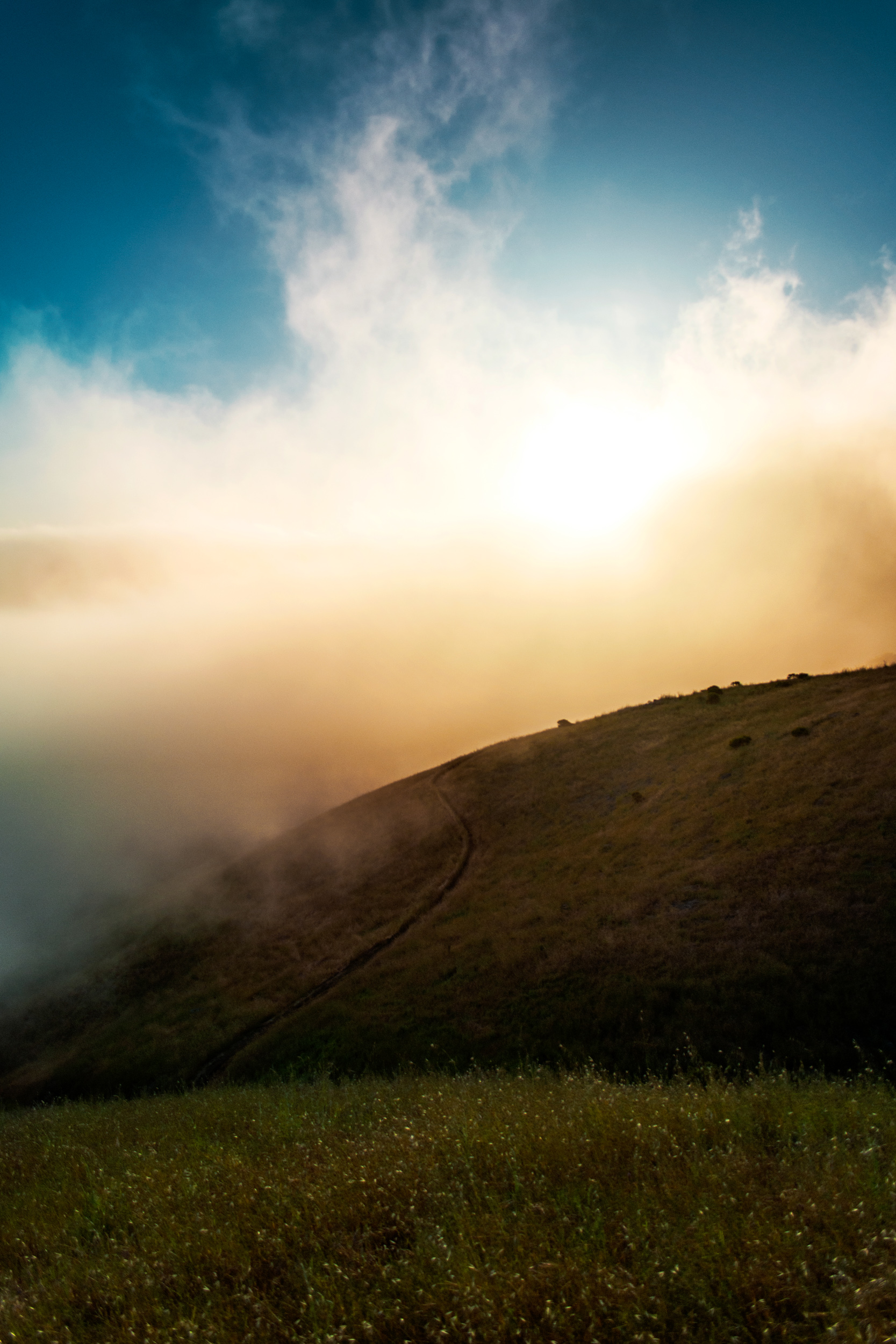
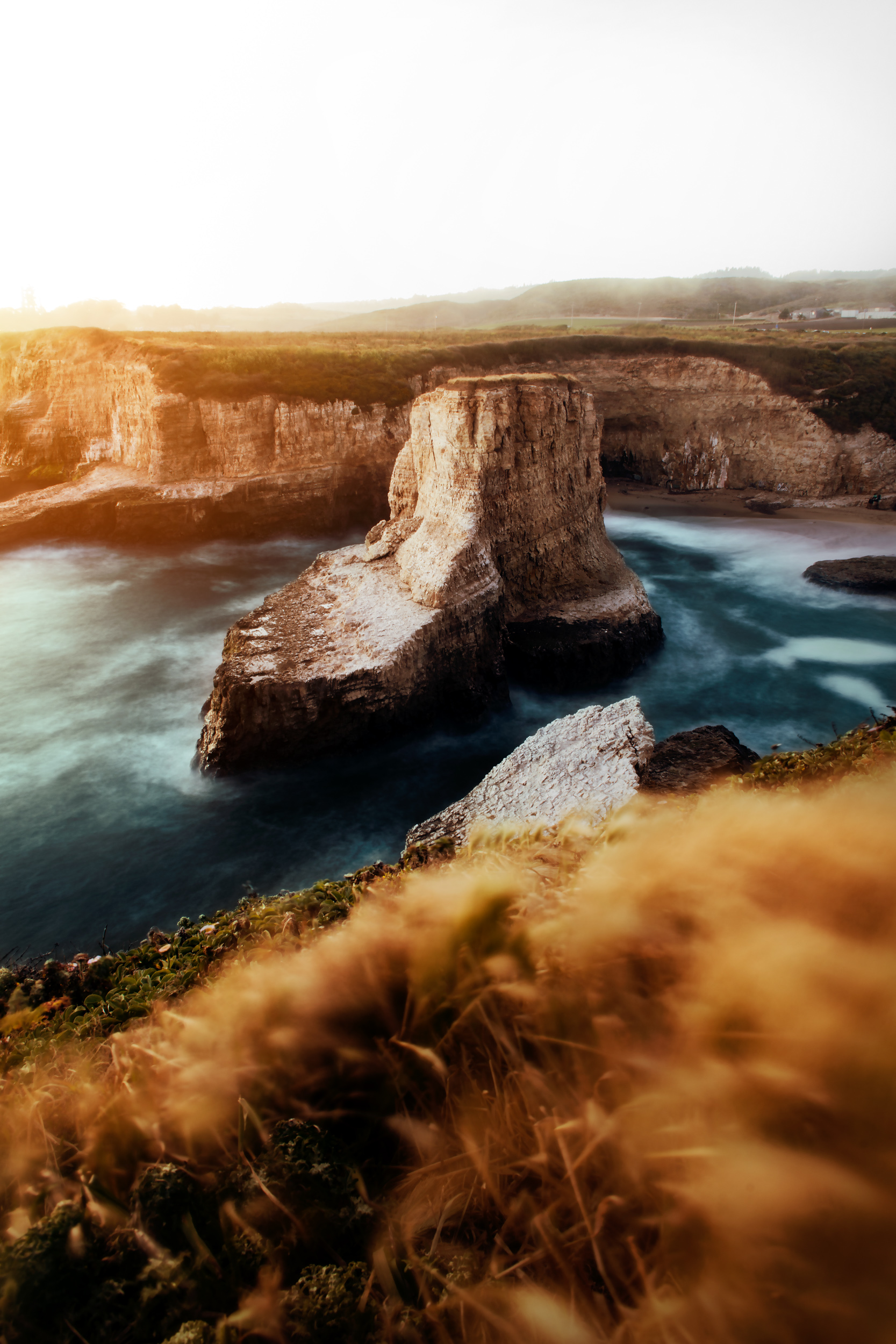
I would consider my page now as much a portrait page as a landscape one. I want to grow it into a portrait page. 

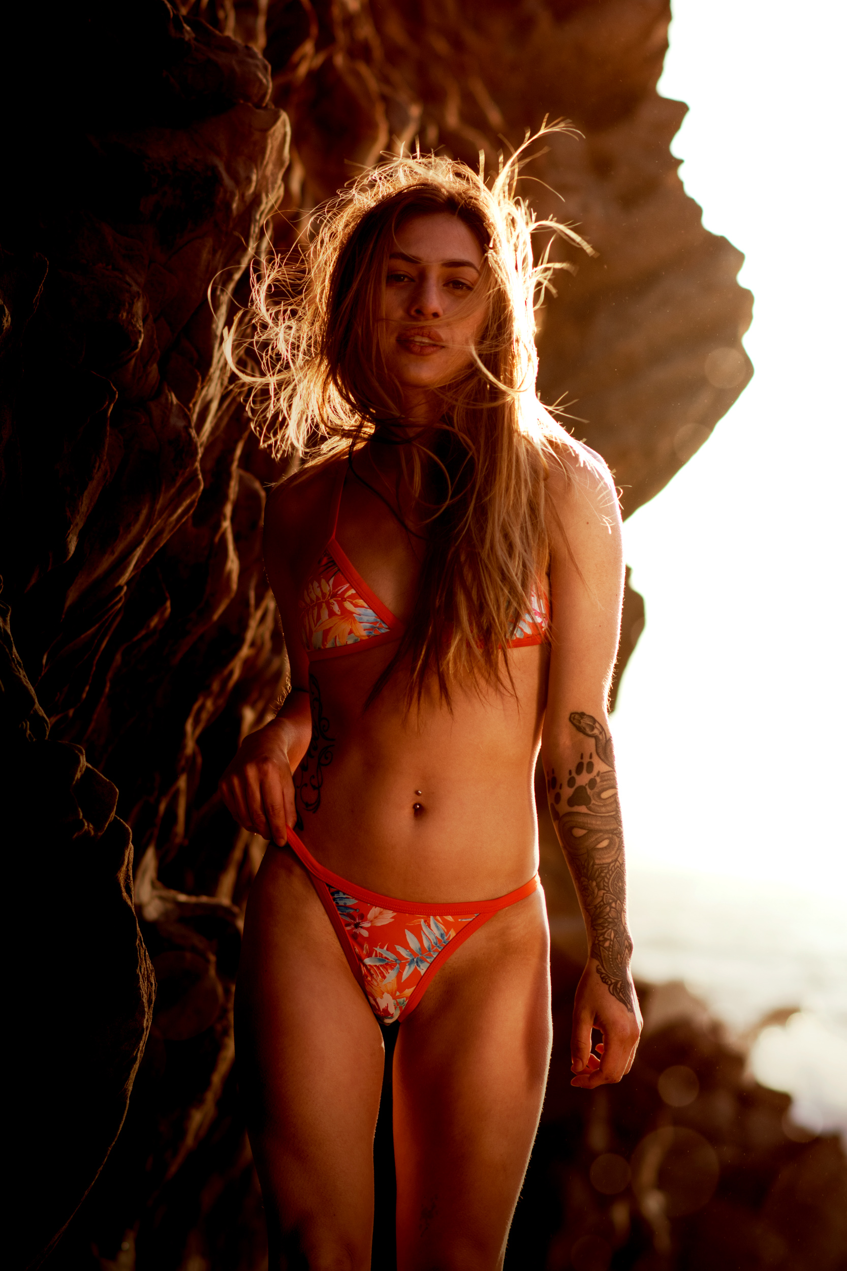
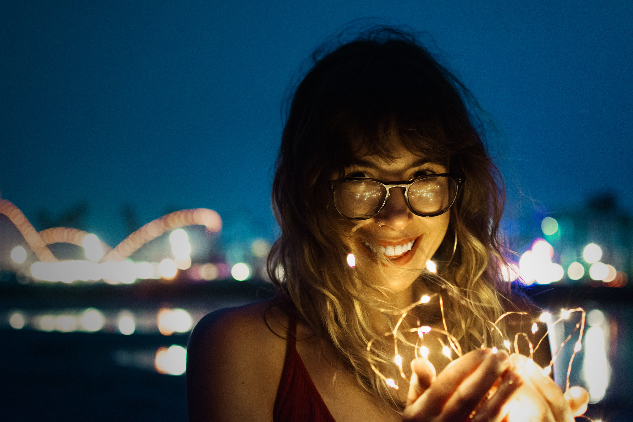
I had two goals at the beginning of this year, which will branch out into a few more that I will talk about eventually. The first goal was to take more portraits. I think that I have been doing a pretty good job of it so far. The second was to meet more people. Lately, I have been doing ok at this. Going to meetups has really helped me meet others. Doing photoshoots has also helped me. One of the things that I wished I had continued with was the stranger's challenge. It was supposed to kill two birds with one stone by meeting others while taking portraits. 

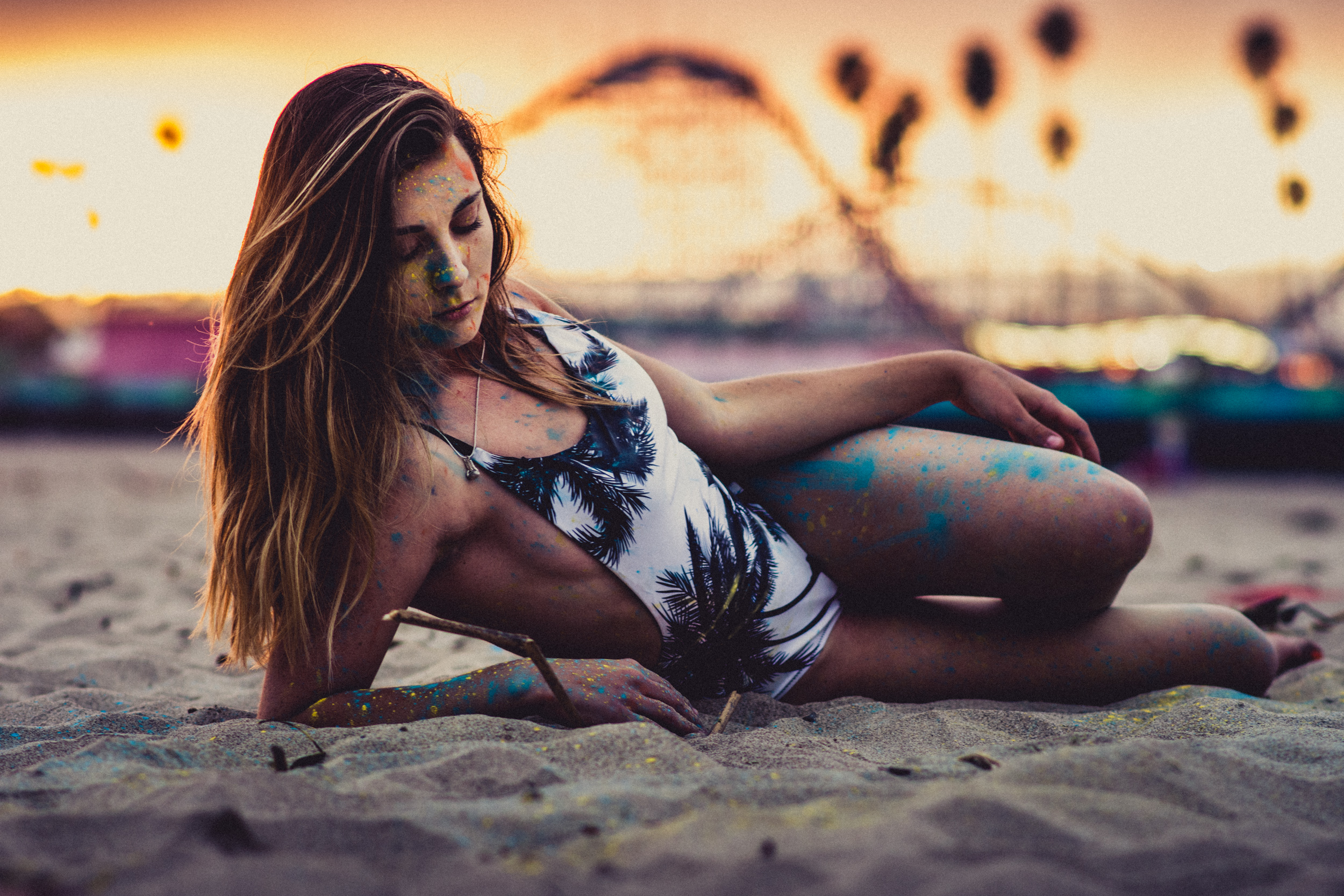
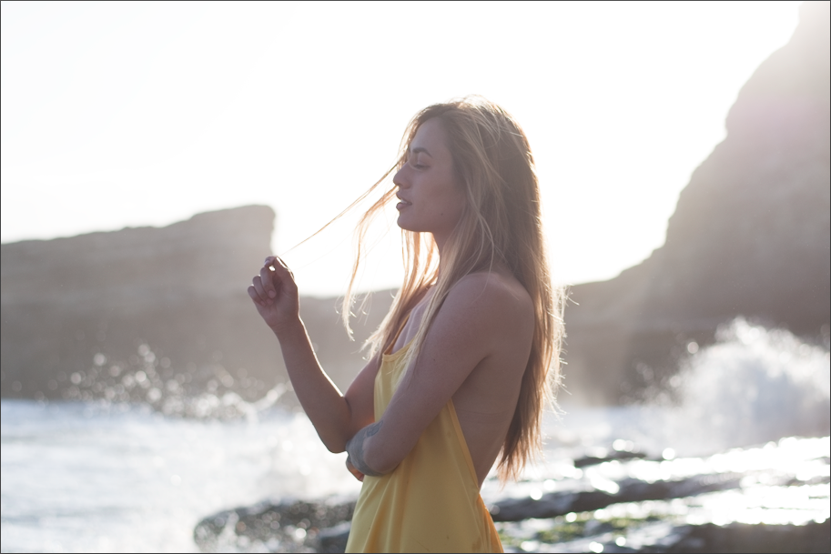
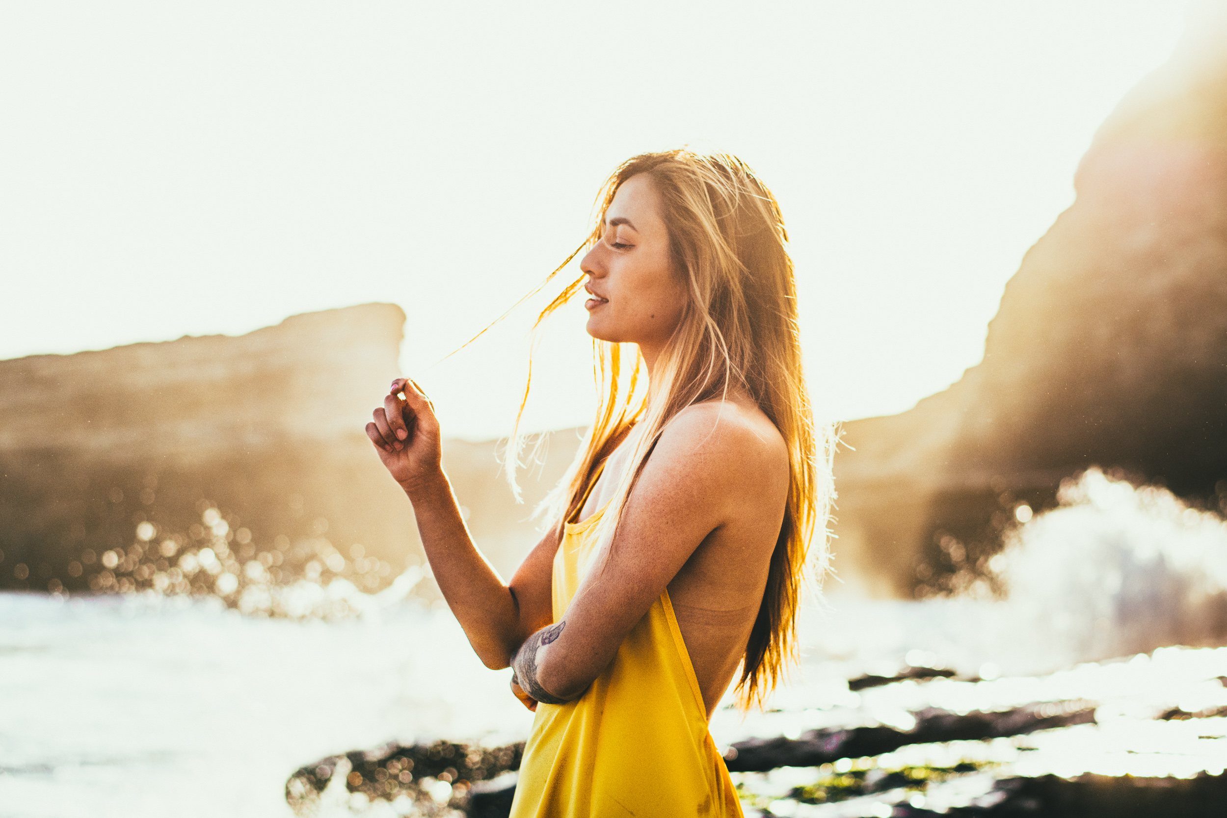
All I can do is continue to do what I do and do it as best as I can. These two are the two photos with the highest engagement of my Instagram right now. Another one of my goals that stemed from the two was to have a portrait be the most liked photo on my instagram. And yesterday it happened with the photo of Taylor. 

Location

Skyline Boulevard Vista Point

Model

Taylor


The Tone Curve

Everyone has a different style of editing. Different color palettes, contrast preferences and tools. One of my favorite tools to use in Lightroom and Photoshop is the tone curve. It is a good all around tool to use to adjust color or lighting. 

Let's start with this image of Dani. It was shot on my shoot with her on the beach during golden hour. It is backlit, so a lot of the background was blown out and a haze covered her in the foreground. 

Screen Shot 2017-06-15 at 1.39.38 PM.png

To start off, I did some adjustments using the basic tools. I made the photo warmer than when it was taken to bring out the summer feel. I did some other adjustments too to bring out the shadows and add a little bit of contrast. Just adding contrast adds a lot of color to a photo, so using the hue and saturations sliders I unsaturated a lot of the colors, along with some hue adjustments. 

Now onto what this post is about, tone curve. There are four curves to work on, when using RGB color mode. The first curve is RGB and controls the lighting on in the photo. Both axes range from your blacks to your whites. The x axis is the rage of your photo and adjusts the brightest and the darkest point on your photo. The graph portion is the different values on your photo. On this photo, you can see that there is almost no points on the photo that are black and some that are white and blown out. When photos are taken with the graph having points on the minimum areas, they cannot be brought back. The y axis controls the value of the points. In this one, you can see that I brought down the brightest point, so it is not white. Similarly, the darkest point was brought up, in order to not make it black. 

The most common curve I use in an 's' shape one, which adds contrast. This increases the amount of dark and light values and decreases the amount of midtones. 

The next 3 curves are the individual color curves. They work in the same way as the first curve, but with the amount of color. To saturate an image, you can just curve them in 's' shapes to add contrast. This requires more precision than it sounds because they all need to be moved the same amount. Increasing the blue too much would make the photo too cool, or too warm if not enough. One thing too remember is the complimentary colors of each of the tones, because those are the ones that will be brought out when adjusting them. The complimentary of blue is yellow, of red is greenish, and of green is violet. 

For this image I started by adding some color contrast. Then, I brought down the lower half of the blue curve to add a warmer tone to the image. I also removed just a small amount of reds in the highlights to bring back some of the green that I had added while adding contrast. It is easy to add unwanted colors when adjusting because moving the curve in any direction will change it to a different color. Its almost like working with the white balance but in a way that also adjust brightness.  

Here is the final image. 

Model

Dani

Editing in Photoshop

I've decided to use photoshop for a while to edit my photos and in hopes that it will help me change up my editing. 

I'll be going through the edits and my process for the past photos I've posted. The biggest difference for me is that Photoshop has layers. I use camera RAW to make the image flat, it's easier to start with if the lighting is flat and the color neutral. The first thing I do is local adjustments and skin cleaning. These are done using an overlay layer and coloring in black and white in the areas I am trying to fix. I use a drawing tablet for the cleaning, since it is much easier to use than clicking with a mouse, pressure sensitivity helps a lot. 

For this one(above), I started by adding some more light coming in from the left. For the color, I focused on the greens and yellows. As most people might find, they are difficult to edit because they are right next to each other and overlap in some spots. I used two different color adjustment layers with layer masks to adjust each individually and in the spots I needed. Then finished off with a curve tone layer and exposure layer. 

This one wasn't much different. In addition to the color layers, I used a gradient to add a bit more pop to the sun. Photoshop layer types allowed me to change the way the layer affects the image. I've found that screen works the best because it also adds some haze, like the sun would.

The photo above and below use one of my favorite types of adjustment layers, gradient map. They're pretty simple to understand, and I'll make a blog explaining them more in depth in the future. Basically, they map the photo from blacks to whites based off of the color scale you choose. In the photo above I used two gradients, one warm and the other cool for the cliff and water. The warm one gave it a golden hour type look, while the blue kept the water cool. Neither were at 100% opacity because that would make it monotone and unrealistic. The one below has a single gradient on it. It added contrast and color to the image. By changing it to overly type, it also sharpened the photo a bit. 

For the one above, I used a single gradient to bring out the warm tones from the light strings. Then, I added a couple of overlay layers to bring out the glow from the lights and to add a vignette to the background. 

The photo above may look simple, but it uses almost all the tricks I've mentioned. In addition I added some bokeh. I don't like the two large ones on the bottom right, so Ill remove them later. 

The one above uses some of the cleaning tricks, but then the color and light was edited in Lightroom. I wasn't able to get the color done the way I wanted, so I moved it into Lightroom to finished it up.

Models:

Bryce

Dani

Ray

Steph

Charlotte